Using the established template from Tutorial 2.1, expanding the functionality to add a RSI indicator to a stock chart is relatively straightforward. The basic framework which pulls stock chart data is already in place, so this tutorial will focus solely on the functionality required to create the Relative Strength Index chart. The RSI is "an extremely popular momentum indicator" according to stockcharts.com, measuring the speed and change of price movements.
The indicator is based on smoothed average gain and average loss values over a pre-specified period. As such, the indicator only requires a single input parameter: the look-back window, which is commonly set to 14 periods. As for the calculation of RSI itself, it requires the following input:
- Average gain/loss, computed as the average of all periods during which a gain/loss was recorded within the look-back window, smoothed in a similar way to how the exponential moving average is computed. This procedure ensures the most recent value is weighted more than older values, which makes the curve more 'reactive' to price swings.
- Relative strength, which is simply the average gain divided by average loss. Values above 1 indicate buyers were relatively stronger within the look-back window, and vice-versa.
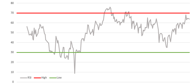
- Relative strength index, which is the relative strength value converted to scale between 0 and 100, where high values indicate strength on the buy side, and low values indicate sellers are 'winning'. 50 is usually labeled the 'crossover centerline', and indicates a switch from strength from either of the sides to the other.
In addition to the RSI value, most charts include a high and low boundary, which in turn can be used as buy/sell signal. Whenever the current RSI hits a boundary, traders take it as an indication to buy in the 'opposite' direction, trying to profit off the assumption that, on average, buyers and sellers are expected to keep each other in relative equilibrium.
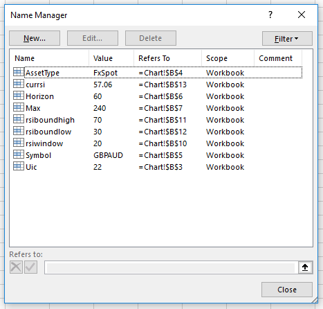
As before, a number of named cells are determined upfront to simplify the VBA implementation:
VBA implementation
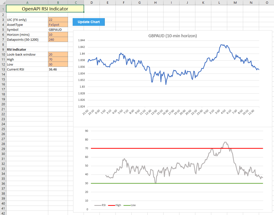
In a similar vain as the previous tutorial, we use the Data sheet to compute all required datapoints and send the results back to the Chart sheet to update the graphs and values. Because this indicator only takes a single input, creating dynamic graphs is relatively simple, as the starting point of the RSI datapoints only has to offset by the time window interval.
As for the VBA code itself, the below snippet shows the calculations made on the Data sheet. Some key points in this script are:
- Average loss is taken as a positive value, hence the difference between last period's price and the current price has to be multiplied by -1.
- Excel automatically ignores 'FALSE' values when computing the average over a predefined series of numbers. This is useful as no further work is required to compute average gain/loss.
- High/low values are taken from the Chart sheet and filled out over the entire range of data to create the horizontal lines on the RSI chart.
- Computing each next average gain/loss value is more complicated, as it weights the previous average by the RSI window -1, adds the current average and divides the total by the RSI window. This leads to the following expression for the formulas in columns F and G respectively:
"=((F" & 2 + rsiwindow & ")*" & rsiwindow - 1 & "+D" & 3 + rsiwindow & ")/" & rsiwindow
'define variables to be used for adjusting ranges
Dim rsiw As Integer
Dim hi As Integer
Dim lo As Integer
rsiw = [rsiwindow]
hi = [rsiboundhigh]
lo = [rsiboundlow]

'compute change, gain and loss
Range("Data!C3:C" & 1 + dmax).Formula = "=(B3-B2)"
Range("Data!D3:D" & 1 + dmax).Formula = "=IF(C3 > 0, C3)"
Range("Data!E3:E" & 1 + dmax).Formula = "=IF(C3 < 0, C3 * -1)"

'compute average gain and loss using input window
Range("Data!F" & 2 + rsiw).Formula = "=AVERAGE(D3:D" & 2 + rsiw & ")"
Range("Data!G" & 2 + rsiw).Formula = "=AVERAGE(E3:E" & 2 + rsiw & ")"

Range("Data!F" & 3 + rsiw & ":F" & 1 + dmax).Formula = _
"=((F" & 2 + rsiw & ")*" & rsiw - 1 & "+D" & 3 + rsiw & ")/" & rsiw
Range("Data!G" & 3 + rsiw & ":G" & 1 + dmax).Formula = _
"=((G" & 2 + rsiw & ")*" & rsiw - 1 & "+E" & 3 + rsiw & ")/" & rsiw

'compute relative strength
Range("Data!H" & 2 + rsiw & ":H" & 1 + dmax).Formula = _
"=F" & 2 + rsiw & "/G" & 2 + rsiw

'compute RSI values
Range("Data!I" & 2 + rsiw & ":I" & 1 + dmax).Formula = _
"=100-(100/(1+H" & 2 + rsiw & "))"

'show current RSI on main window
[currsi] = Range("Data!I" & 1 + dmax).Value

'Add datapoints for high/low lines
Range("Data!J2:J" & 1 + dmax).Value = hi
Range("Data!K2:K" & 1 + dmax).Value = lo
Sanity check
As before, we confirm the validity of the generated chart by comparing it to the RSI graph generated on the SaxoTraderGO platform. Let's consider the following random scenario:
- The instrument in question is the Australian Dollar / Japanese Yen cross.
- Horizon of this study is set to 1 hour, with the last 10 days as historic data.
- RSI look-back window is set to 14 periods, with highs at 70 and lows at 30.
In GO, the following graph is created:
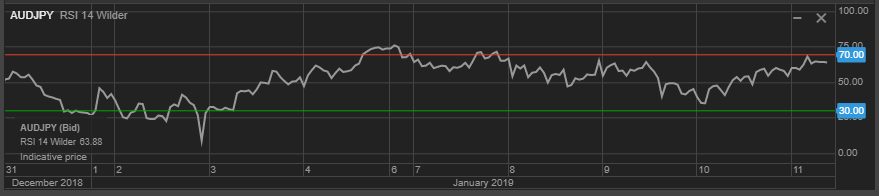
Which compares very well to the Excel implementation. In addition, the current values of RSI are both in agreement at 63.88, indicating that this currency cross is close to being oversold (given the above assumptions).